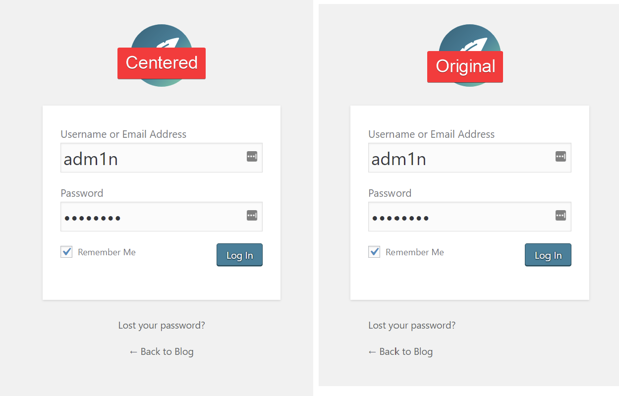
Am I the only one who gets a bit annoyed every time I look at CP/WP login page with the lost password/back link being left aligned? It looks like the form is about to tip over and fall to the right
What’s worse, the privacy link is center-aligned.
What does everyone think about center aligning them?
I didn’t want to create a petition for something that can be fixed with text-align: center added to .login #backtoblog, .login #nav.
It is a question, though. I would like to see this implemented in the core so I don’t get annoyed when I try to log in But I want to see what everyone else thinks. Maybe it’s just me being crazy.
Apparently it’s not just you, but there is a convention that no text is centered without the user asking for it.
So it will be on the left as normal text is for LTR languages and on the right as normal for RTL languages.
Centered text is harder to read, and if a site has a long title, it will wrap around.
I think centering the text is horrible! The fact that there’s an arrow pointing to the left clearly suggests that that particular line of text especially should be left aligned (just as on paginated links). Please leave this alone!
That’s my other problem with that link specifically. One, it presents itself as a back button but it’s not. It takes you to the homepage, I’m rarely on the homepage when I want to log in. Two, I never understood the point of having blog title being part of that link. A more accurate text would be “Visit Site” just like the link in the toolbar. Other options code be “Home”, “Go to homepage”.
I guess it’s been there since the early days when people included login links on their website, in the sidebar or the footer. So technically it was a back button back then.
It’s a link back to the front of the site. It has the name of the site because domains may contain numerous sites with similar or identical branding on the login page, and the name indicates to which site this particular login refers. For someone like me, who works a lot on such sites but who goes to the wrong login sometimes through muscle memory, it’s extremely helpful to have the message telling me where I am. “Homepage” would be hopelessly generic.
Is there any other text which is centred by default or does it all abide by the convention of being on the left for left to right linguages as @joyously mentioned?
I can see you’re not familiar with how medium+ size organizations run their websites. They rarely use multisite installs, but instead have multiple individual subsites on the same domain in both subdirectories and subdomains.
It’s telling that you keep talking of “blogs”, yet the one thing we’ve been clear on about CP from the very start is that we are focused largely on websites and not blogs. I therefore find your continued reference to “blogs” to be spurious and misleading.
Blogs, websites, that’s just semantics. I also recall our homepage says CMS for creators, it doesn’t say businesses, blogs, ecommerce, etc. A few years ago it did mention businesses, but we went away from being so specific. So in reality, your statement is misleading.
And frankly, a blog is a website. I’ve seen more blogs powered by CP than business websites, ecommerce websites, etc. Quiet a few people here in the forum have blogs powered by CP.
So even though we’re making CP more CMS-like than WP, that doesn’t change the fact that you can use it to create a blog. You can create whatever you want.
I’ve never understood why people say something is “just semantics”. Semantics are about meaning. It’s particularly odd when talking about building websites, since we often talk about using semantic markup for accessibility.
It doesn’t botter me… but now that you mention it, it still doesn’t botter me…
Maybe it depends on the situation. When it doesn’t matter much, say in casual conversations, we can speak as if a blog and a website are just synonymous. But when it does matter, say in technical writing, then we can be more specific about the differences b/w the two.
“just semantics” is a common phrase which is used to say “we’re talking about the same thing just using different words”, they could be considered synonyms in this context. I don’t want to get into another discussion about this, I know what semantics are. I’m using this phrase since it is part of the modern vernacular, like it or not. Just like irregardless or “break a leg”.
If we go back to our original conversation and talk about semantics of blog vs website. Oxford defines website as “a set of related web pages located under a single domain name, typically produced by a single person or organization.”
That definition encompasses everything, business websites, ecommerce, intranets, SaaS, and yes even blogs.
So you can’t say CP is for building websites and not blogs, that doesn’t make sense and is misleading. If you would like to clarify what type of website, that’s a different story. I will still disagree, because CP is a CMS for all creators, not just the ones you like
When people say that text should always be left-justified, left-justified in relation to what? Left-justified implies a defined edge or margin… this text is just floating in space (and it’s floating slightly off-centre). Would this be an improvement?
We all agree that centre-justified is annoying when it’s a whole block of text. This is just a few words and looking at the examples in the first post I personally think the centred example is better design.