


Oooh, I am partial to the last one - especially the mint green color, but all three are really good. Thank you.
Was just playing around. It’s hard to make something simple. Easy to add too much. Look at Shopify, just a green bag with a big S.
Let’s see what others come up with.
2 Likes
I never understood/liked WooCommerce’s speech bubble around Woo. Let me throw in couple of ideas, too. I’ll be back.
1 Like
Few ideas. One thing I would recommend is to use a different color palette from ClassicPress, same as not using classicpress.net sub-domain. So there’s no confusion that CC isn’t official product of CP.
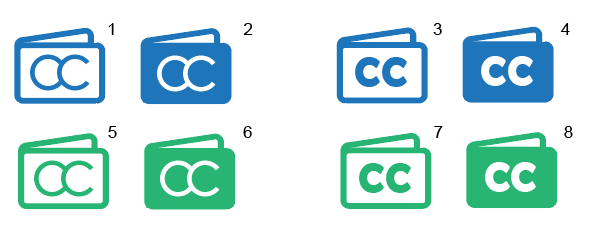
The icon is a wallet, FYI.
3 Likes
I like 4 & 8. Blue is easier on the eyes.
I think adding a small flap to the right, maybe with a black dot on it, would make it more obvious that it’s a wallet.


5 Likes
I prefer the group on the left. Nice variant on the vesica Pisces.
1 Like
Ones on the left look like they could be OC instead of CC
1 Like
I like 4 & 8.
Me too!
Graham’s flap is a possibility, but I prefer the small white square, not black.
1 Like
I like the wallet idea. It’s clear and also different from the plethora of “shopping cart logos”…
3 Likes
I really like 4 & 8 ![]()
Great to see people taking the plunge with this, thank you everyone!
2 Likes
I prefer 7 over 8 myself, but I like both designs. Love the green, green always feels more like a money-related color than blue. Love the idea of adding a little clip to the wallet that @Graham had, though it would need to be a bit thicker to fit the design imho. Also, I dont think the black square works, since black isnt used in the rest of the logo, white works much better.
8, definitely 8. Also green is the color to go. Although I am in Europe (and our money have all kinds of colors), green is the color of money.
2 Likes
Yes indeed. Our A$100 note (the biggest we have) is green. My favourite bank note!
1 Like
It seems most of the web these days is blue so the green will stand out (plus I like green, but have to hold my hands up to having only one green website and about 8 blue ones).
2 Likes
1 Like
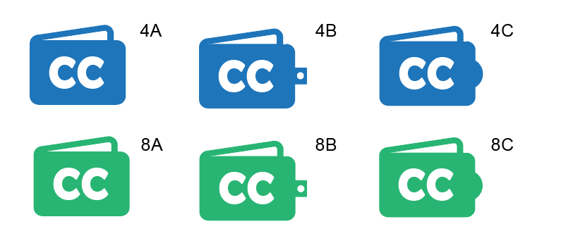
My vote is on 8C, but in the end it’s up to @parkerj as the forker. At least you have a lot of good choices!
I like 8C as well, but also torn between it and 8B. @viktor, thanks for your work on this. If you don’t mind, I have one last request. I would love to see what some variations of 8C would look like if there was just a bit of coins or bills sticking out just a bit on the top.
3 Likes
I think the aim of any logo is to be as simple as possible. 8C does the job better than 8B, which adds an unnecessary distraction.
Adding notes poking out would just add clutter. I think this is as far as we need to go for now, otherwise it will just drag on.
It could just be my eyes (koalas prefer night time), but the green is a bit overpowering. Maybe drop it down in contrast a tad, making it more mint than bright.

2 Likes