Discussion/proposal: Center lost password/back links on login page

Oh, right. I never noticed that. To me the square with the white background is one distinct design block and it looks nicely balanced. There are 2 other design “areas” - the logo above it and the text below it. The logo is centred and also looks balanced with the overall layout. The text below is just floating in space and looks lop-sided.

I’m not a graphic designer, so maybe talking nonsense (quite possible, in fact).

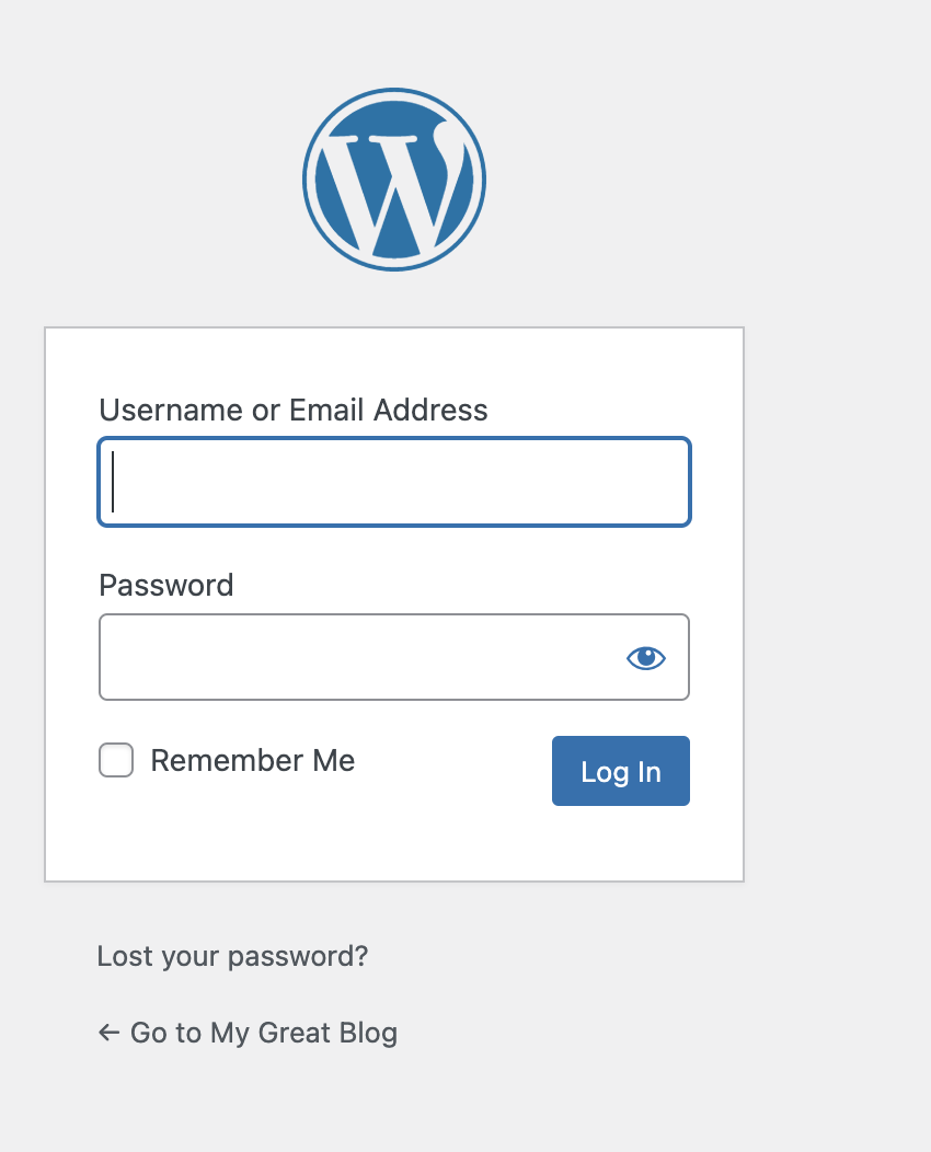
As we can easily see when looking at WP installs, that “Go back” String was indeed changed to “Go to”, which confirms that it is wrong to call it a “go back”.

==> We might come from anywhere, inclusive external url, and “go back” would technically mean to go back there.

We don’t go back anywhere, we go to a single, specified location: Your main homepage url.

Thus, the right string is “Go to”.
And that is what WP uses.

This was changed here Text Changes: Unify various "Back to..." vs. "Return to..." vs. "Go t… · WordPress/WordPress@a2d4235 · GitHub, unifying various such bad wordings that used “back to” or “return to”, to use the “go to”

Thus, I can only agree that this string probably should change, and all others they changed there probably as well.

As for center aligning that, I see nothing that would break doing that.
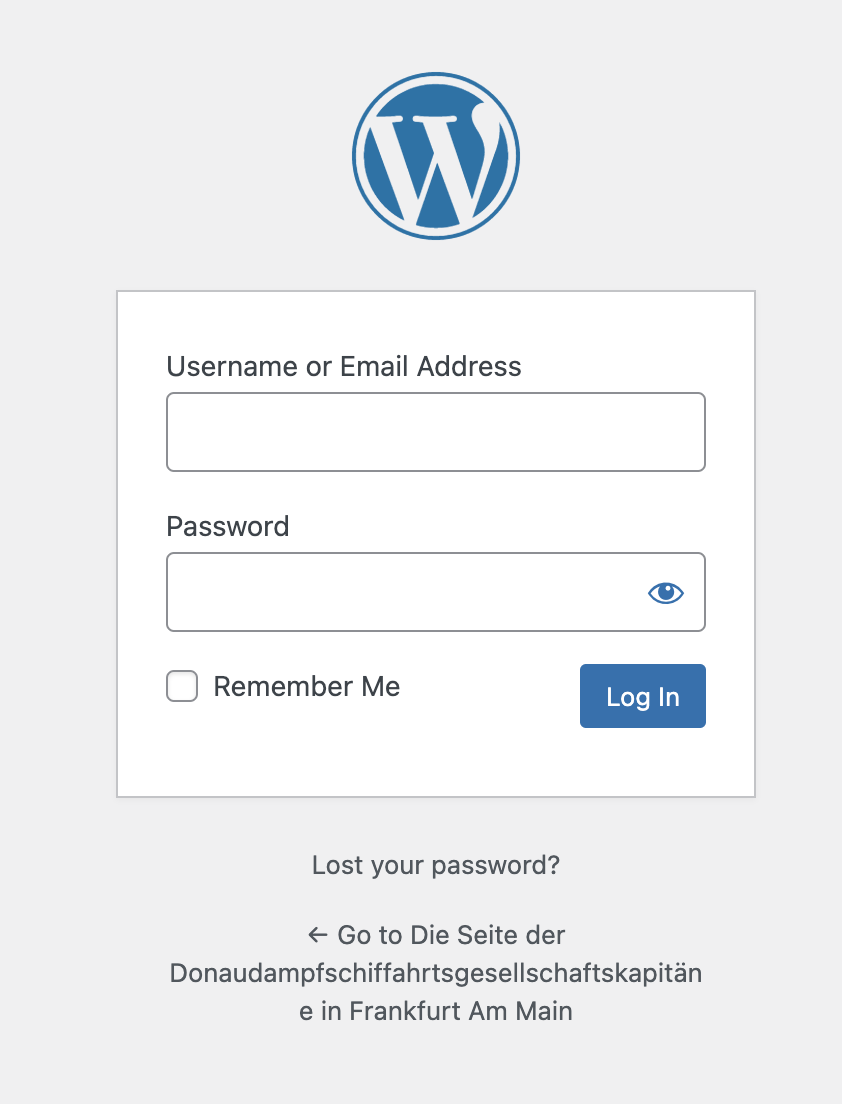
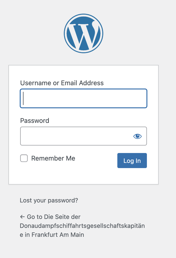
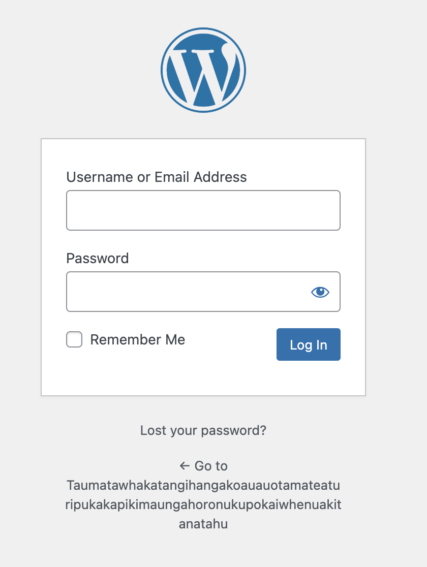
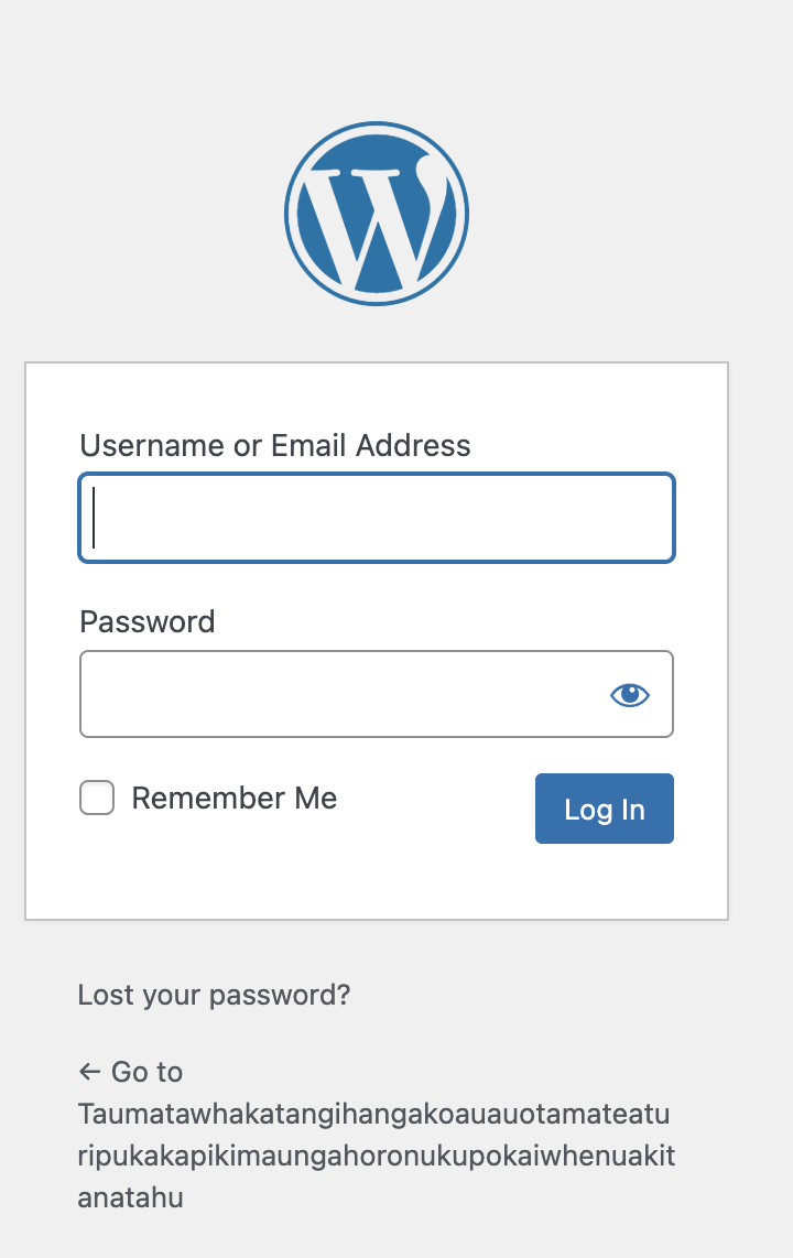
Langauges with long words (German is not really the only example for that, check welsh town names or Taumatawhakatangihangakoauauotamateaturipukakapikimaungahoronukupokaiwhenuakitanatahu, a town in NZ) do not “break” due to alignment. They wrap no matter what if you align left, right or center.
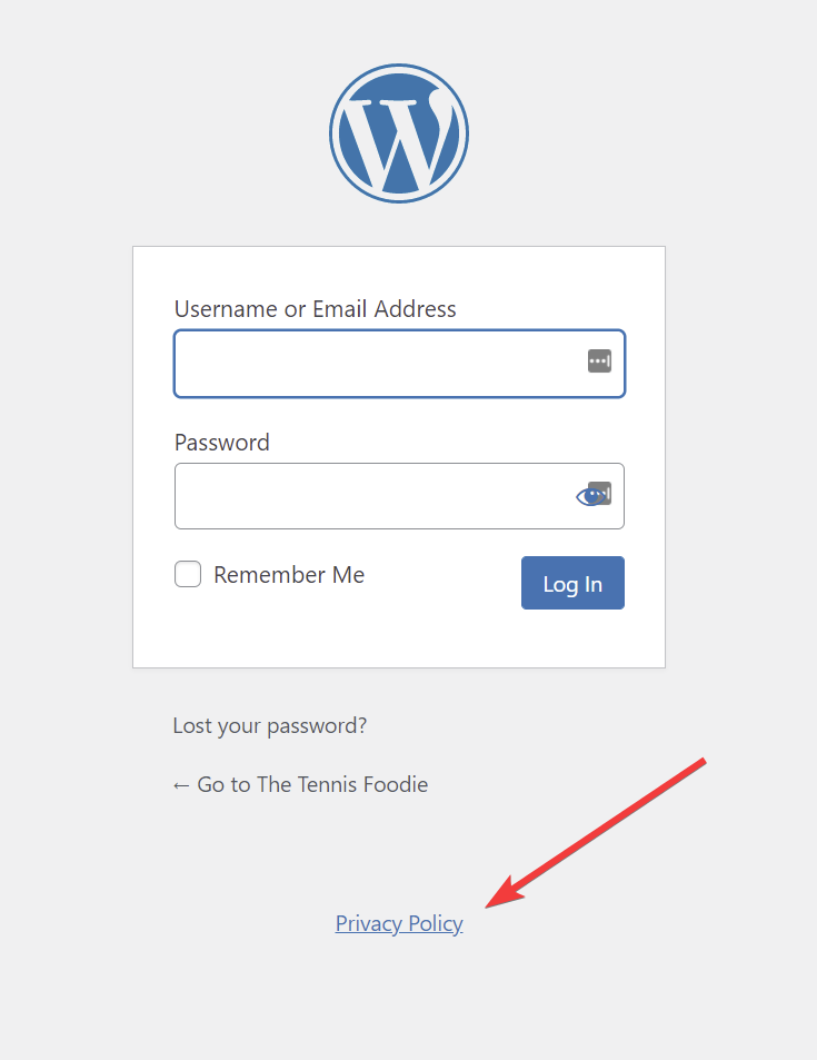
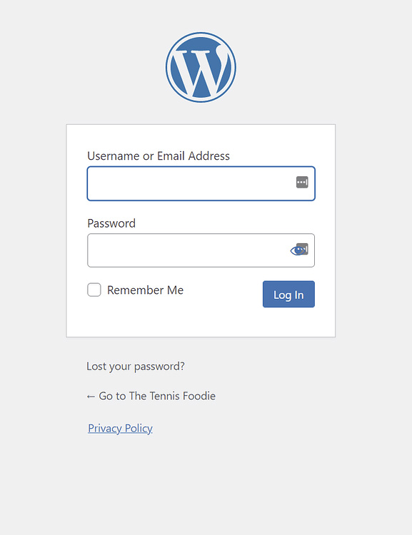
See screenshot of long name left aligned versus centered. There is a word break, so it will look ugly in either case, wether left or centered.


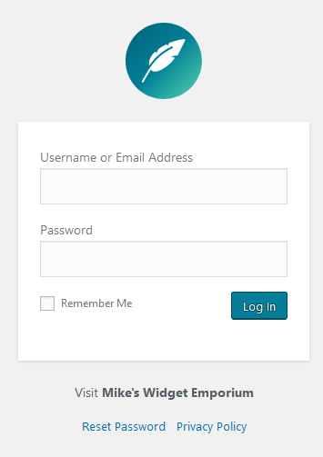
That said… if there is some sort of convention determining this, then we of course need to change the privacy policy and as well the logo, which are centered by default. Thus if there is such convention, it has not been respected throughout the entire login screen.
(They chose centered logo because WP has a single letter logo. What if I have a logo that looks better when right aligned? Or left aligned? For example an artistic site playing with asymmetry could be wanting that.)

The only problem with changing it I see is that next comes the labels for the inputs. Should those be centered? It’s a preference. And thus, we likely just should leave it alone since we never will satisfy everyone, and it’s easy enough to add CSS on your site, or even modify said login screen, to have something looking like this for example Bootstrap Snippet My User Login Page using HTML CSS

I can’t help thinking that the amount of effort that has gone into this question might have been enough to get out CP v2. :joy:

2 Likes

Exactly my thoughts, which is why I spent the 45 minutes and went all the way and made sure each possible scenario is tested, because otherwise we will proceed assuming, versus actually testing/make informed decisions :wink:

I hope now we can agree the string should change (low priority thou), while the alignments shouldn’t, since it’s an user preference alltgt, and if anything, we should align everything on one direction, and let the user add CSS where needed (and since it’s been like that for years, I think the time we’d spend in making that change is again better invested in other, more important work)

Just out of curiosity, why is privacy link centered then? I assume there had to be a decision not to left align it.

@anon66243189 is right. I didn’t even notice the difference between CP and WP. WP did update the text to “Go to”. I would at least want that change incorporated into CP, if center alignment is a no-no.

Links to privacy policies typically go in the page footer, and this is being treated in a similar manner. So it’s not part of the content of the page. That’s also why there’s a larger amount of whitespace above it.

Changing the text to “Go to” is fine by me.

Yes, that’s it. I see all three of those links as “footer” and the login box as “content”. That’s why I feel they should all be centred.

But the previous two links aren’t in the footer. They are part of the content of the page.

Not to me. Miscellaneous links using tiny font? Looks like footer material.

Very strange footer then: there’s a massive gap between the first two links and the privacy policy. That’s the role of whitespace: to divide things up.

Yes that’s what we have been saying. It’s bad design. :slightly_smiling_face:

Even this would be an improvement.

I wasn’t part of that, but I assume that it is like a footer for the page, since it isn’t related to the page content. Footers are often centered, as are headers (logo).

1 Like

No, it indicates something. Though, if you want to left justify the privacy policy, that would be fine, as footers can be left justified too.

Here’s my opinion on it:

Anyway, if anything gets changed, do away with the arrow glyph – it’s intention is to indicate “back” which, as noted elsewhere here, is not correct. Not to mention that it throws off the balance of the text.

…and yes, the underline is intentional. Or, in place of that, perhaps a font size of 125% to help differentiate it.

6 Likes

Now this is more like it.

Gets my vote. @anon71687268 has nailed it! :+1:

1 Like

I created a PR which results in the following. Feel free to pick it apart.


5 Likes

What happens if there is no privacy policy? Does the reset link move under the visit?

Of course it does. :wink: I added an additional screenshot to the PR.