Always been a big PITA: The user interface for the revision system. Just a few hours ago I had another run-in with it, essentially wasting the revision I actually wanted to restore. Tried it a few times … thanks to not being clear WHICH part we are currently trying to restore.
I’d like to see a few PROPER, well-done highlights and pointers to fix that issue.
I think all it really takes to the confused mind is to click “Help” on the top right screen area, and read there the instructions how to use this very simple tool.
Amongst other helpful things, it will say there:
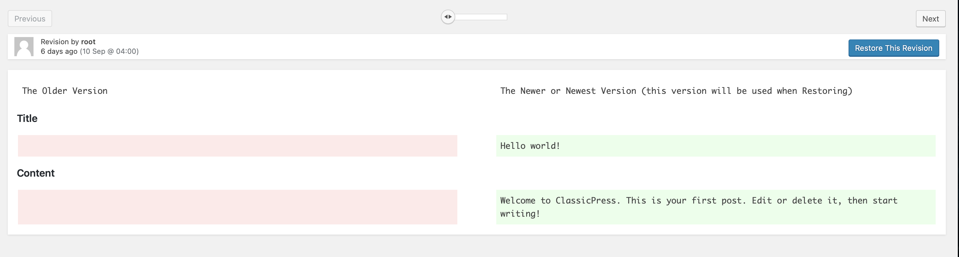
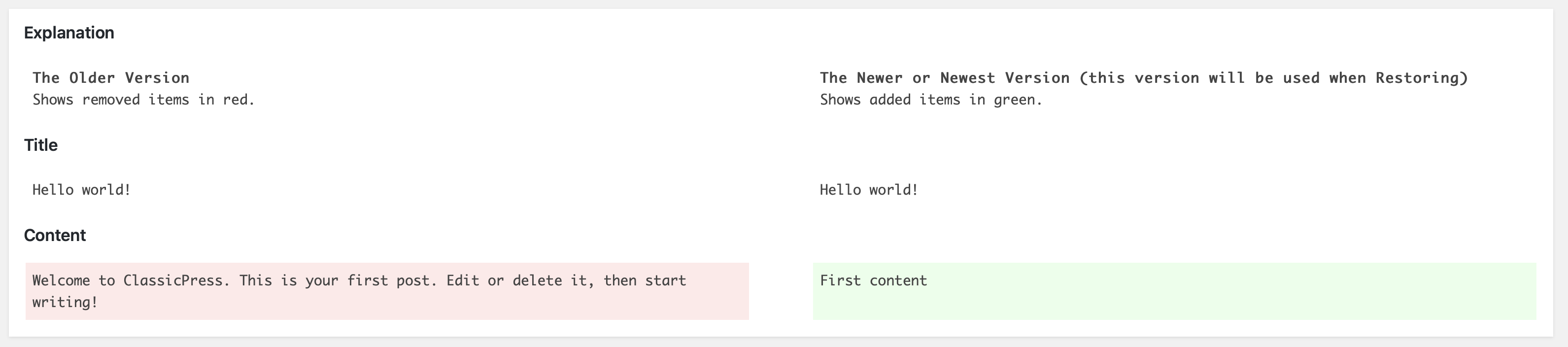
The red text on the left shows the content that was removed. The green text on the right shows the content that was added.
[…]
To restore a revision, click Restore This Revision.
If that is still unclear (it is actually very clear also without reading this help text), then I think even a “PROPER, well-done highlights and pointers to fix that issue.” doesn’t help, because that is already what is happening:
there is a red highlight on the left for things gone
there is a green highlight to the right for things new
the entire screen represents a revision (so, of course, the left and right side are diffs of the same revision, representing the changes, they do NOT represent 2 different revisions)
I would propose to close this petition as IMO there is nothing to change or do better (and if, then we need to have some proposal as of what exactly would be the desired betterment. Just saying something is bad doesn’t really help, we need to be part of the solution)
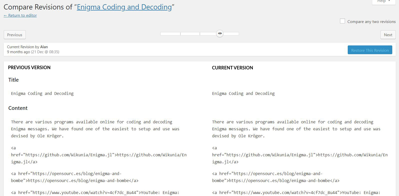
But where to put those “current version” and "previous version’?
The very screen does not show 2 versions, it shows the same version where removals and additions are shown.
It is basically always the “version that will be used if re-instantiated”, unless you are on the last revision, which is the current version of the post.
But that is exactly it.
This is not how the revision screen works
Left and right are the same versions, it is just one with removals and the other with additions, it is not 2 distinct revisions.
It is the same one, with a proper diff look.
Basically, each screen (each step in the slider bar) is one revision.
If you go with the slider full to the right, you see the “Restore” thingy gets inactive because there is nothing to restore. You are on the last, active version
Now if you go a step to the left with the slider, the “restore” thingy becomes active, and if pressed, it restores that active revision, which is the entire screen. Left removals, right additions, but it is the same thing
While for me it is clear that green means “added” and red is “removed”… it is also right to say that left is “old” and right is “new”.
This especially becomes the case when you “compare any two revisions”, in that case left will be the “any older” and right is “any newer” version, and reinstantiating would mean to reinstantiate the right side!
I think for me it was always expected like that because the chronology goes from left (oldest) to right (newest) and thus, if I am able to click “restore” I will get the newest version I see on screen, which is the right side, but I need the left side to see what was removed, versus the right side that shows what was added.
So … concluding probably you are right after all?!
So perhaps I am the one who sees it wrong and accidentally never had an issue with that.
This is a place where WP just got it wrong, IMO. The revisions are essentially diffs… this was added, that was removed. That’s great if you know what a diff is, but, my guess is that average editors haven’t even heard of a diff. I think revisions should have been implemented to show just the final revision, with arrows to navigate back and forth in the history, without the split-screen of diffs. This feature, as implemented, is near useless for the intended audience.
Yes, same here. The revision UI is beyond awful. I’ve never understood why there have to be 2 versions side by side, and I’ve never been clear about what will result from any clicks I make.
In my view one revision should be shown, with a link to preview it (or even an iframe). For me, the headings don’t make much difference.
If this means I’m misunderstanding it, then perhaps asking why I and so many other misunderstand it would be a useful exercise.