Yes, this would be a much more intuitive approach. Drop the right column and keep the left.
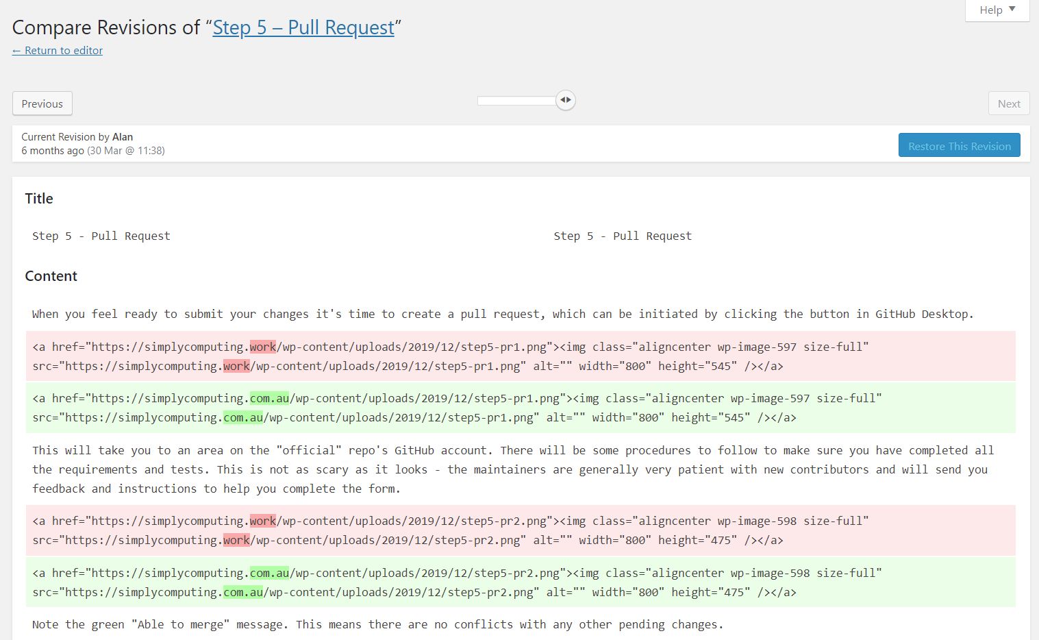
That way the slider would just go back through the revisions. You can still pick out the text that has been changed because it is highlighted in red. When you see a revision you like, click “Restore This Revision”.
It seems to me this feature is a good example of getting too clever to be useful.
Thought I would give this a try. Could not find revisions.php but third go lucky with revision.php in includes in wp-admin.
Single pane makes more sense.
Although I can’t remember ever restoring a revision.
I would have gone through the revisions to see what changed, when memory failed or someone else had been editing but as other edits had probably been done as well restoring a previous version would only create more problems.
I would have found the content I wanted in the revision and just copied the section and then returned to current version and paste.
This only changed the two panes into one. It is still showing two revisions and the differences between them. I find it easier to distinguish what goes where when there are two panes.
I think the problem is what is being compared. I think it’s comparing two adjacent revisions. But what if it compared the revision always to the current editor contents? That way, if you restore that revision you know what you are losing from the current state.
If the right pane was always the current state, then it’s obvious that the left is the revision in question and which would be restored if you click the button.
I have always thought the revisions UI works just as intended/desired. The “diff view” is a bit technical but there is not really another way to do this correctly. It compares two different revisions, though apparently it could state which two revisions are actually being compared more clearly.
Maybe we could do the following:
Add clear labels for the two revisions that are currently being compared.
Add a toggle between “split diff” mode (two panes) and “unified diff” mode (one pane) in the UI.
Document what is going on more clearly? This is already done in the Help tab though, so I’m not really sure what this would look like.
By default, the right pane is the latest saved state. It doesn’t have to be, though - the current UI offers the ability to compare two different historical revisions, neither of which are the latest saved revision. This is a valuable feature that should not be removed.
I think comparing to the latest content in the editor is not feasible. This would mean the comparison would need to be done in JavaScript instead of PHP as it is currently.
One thing that would be technically feasible, but seems a bit clunky for users (I’m having trouble wording it well): We could add an indicator to the revision screen that says something like “You have unsaved changes! Save your post to compare it to the revisions currently being displayed.”
That doesn’t seem to be right. The UI in the editor shows me a list of revisions and I can click on any of them so I start with that revision on the right, and whatever revision is older. I can then move previous and next. This changes both left and right panes to the two revisions that are adjacent.
Yes, I agree that this should remain. Perhaps using the labels that that process uses (From and To) on the default would make it clearer what is happening.
You are correct, it would be more difficult, although the auto draft is there and could be used.
Right now, if you type something in the editor and even if it auto saves it, clicking on a revision will show the confirmation box to leave the page with unsaved changes.
I have be been using WP for long time, maybe too long, only just noticed the compare any two revisions tick box.
The default is unticked
The panes then compare two adjacent (in time) revisions
With the box ticked
Any two revisions are comparable
So drag arrows to the right and the right hand pane is the latest saved version and using the other arrows the left pane can scroll back through previous saved versions.
That works for me.
If the ‘restore this revision’ button was above the pane to be restored it would be better or maybe one button above each pane then it would obvious which version was being restored.
Interesting. I found the single pane view much easier. In the example I posted, the changes are aligned vertically and I find it much simpler on the eyes to compare them. But that could be because I use GitHub desktop and it looks the same as this.