Okay, I may have exaggerated a bit… ![]()
![]()
Okay, I may have exaggerated a bit… ![]()
![]()
Quoting from the original thread (not me):
I think centering the text is horrible! […] Please leave this alone!
I don’t agree with changing it either.
We don’t see anything like this on any of the other petitions we have recently decided to implement.
This has - at the moment - 5 votes in favor and 3 opinions expressed against the change, one of which happens to be mine.
I don’t want my opinion or that of any other “small handful of vocal developers” to “overrule the rest of the community” but that’s not anything close to universal agreement. I think looking for more context to inform how to make this change better is obvious and reasonable and I honestly don’t understand why there has been so much resistance to that request.
Fortunately this change is minor, so I’m not going to argue about it anymore.
I think separating a petition into two parts dilutes the discussion, even if there is a link back to the original.
I also think original reasons for designs can be important, and have hidden connections in the code that can cause issues. Since CP has so many fewer testers (and people who vote), it’s important to not change things on whims.
With the small numbers of votes that get cast on any given petition, 5 could well be a majority, not a whim. We only ever get about 7-8 votes for anything.
Surely the real issue here (if there is one at all) is actually one of accessibility. Why are these links not underlined by default? I don’t know the answer, but that looks much more problematic to me than anything else so far discussed on this or the related thread.
About History
https://core.trac.wordpress.org/ticket/7413
https://core.trac.wordpress.org/ticket/8286
About Voting
The Feature
Go for it, but only if:
p, I think it has some potential there to break existing “designs”)Simpler solution
Just do what some WP users have been doing for the past 13 and more year:
apply no more than 8 lines of CSS code, something like this should work
body.login div#login p#nav {
	margin: 20px auto;
	text-align: center;
}
body.login div#login p#backtoblog {
	margin: 0 auto;
	text-align: center;
}
Why not just create a code snippet or tutorial out of this.
I alone spent over 4 hours on this issue by now, reading, investigating, reporting and commenting.
Counting the amount of users on this, the other, and Git… I think we invested an enormous amount of time (and patience!!! and actual work!!!) in this issue already. Without results.
That time, we could probably have fixed the WP User Object in CP.
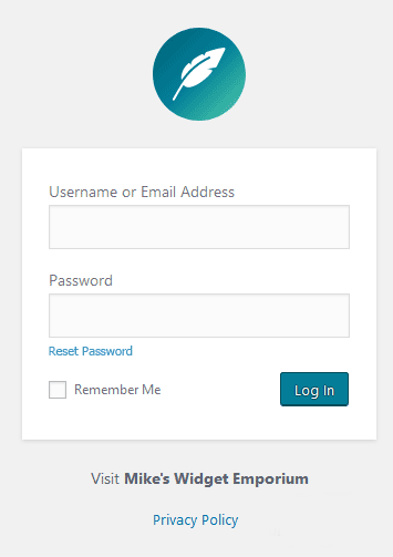
I think it looks odd centered, but my main objection would be including the Privacy Policy link in the main prt of the page as I’ve always regarded that as footer rather than part of the page as it has nothing to do with logging in.
To me, it looks like the developers said: “And we’ll need to have three links down here somewhere… we’ll just shove them in for now and come back and sort it out later.”
But then the beer and pizza arrived and they forgot all about it.
If you do nothing else, at least get rid of the pointless back arrow icon.
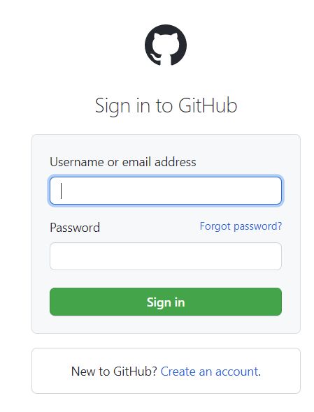
I was just talking to my son about this and he made a really good point. He said that typically the “forgot password” link is somewhere up in the login box along with the login fields, because it is actually part of the login process. Like in this example…
So maybe something like this format would be more of a standardised approach…
The problem is, there are actions and customisations used since years with existing layout. If we just go and start moving things around we will break those customizations.
This all is a thing we can think about for CP v2, also because we seem to extend this petition more and more into an actual redesign that not only touches looks, but also under the hood functionality.
The path of least impact is to first rename all the “back to” to use the new standard convention (see git ticket for reference).
Doing that, remove the arrow.
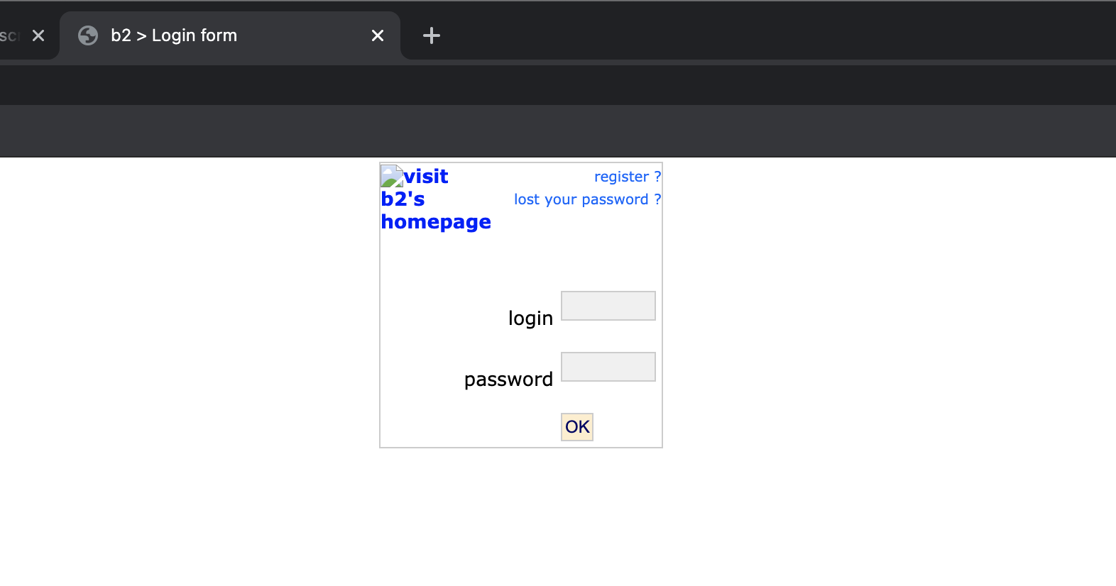
Then, think about a v2 version of this login screen. Use a designer or a design-capable person to design it and do not repeat the mistake WP made 13 years ago of letting a marketeer and developer decide how this looks (I suspect it even was inherited from the “mother of all mothers” b2/cafelog)
Then, re-implement the whole login experience, with new hooks, new design, so that we break things (because there are a ton of plugins using that code, as well as people having customised it)
And at that point we can have all bells and whistles we want.
At this moment, we can not move the links out of the footer since they are expected to be in the footer.
Funny anecdote, this is how b2/cafelog login screen looked like:
Sorry, I don’t understand. Is there some functionality that relies on the position of a link on the page?
See my updated post above.
There is an action, called login_footer, login_footer() | Function | WordPress Developer Resources and that can be used and is used to add/manipulate things in the login form footer.
That action outputs the links in the footer, amongst other things.
Now if you move that link, you change what the action does, and thus, all code using, relying or else based on that action will break or at least output weird stuff.
Also, we cannot simply move things around. WP is not a HTML based tool, it is PHP based, it is based on hooks, so you will always need to consider what hook does actually produce what part, if you want to change its output. It is the case in most cases, at least.
And hooks are always used widely by plugins and themes, for example.
So what is regarded as the footer? People have been saying the privacy link is the “footer”, but the 2 links above it are somehow part of “content”.
Check the code and doc linked, it is best to understand this.
Footer here means “login form footer” and not “site footer”
Yes. It looks to me like the “Go to site” link and the “Privacy Policy” link are both treated as footer by that WP function. So it makes even less sense that they should be completely differently designed links.
(And no-one was proposing moving either of them out of footer. Just treating them the same.)
Yeah probably you’re right… I might confuse things up here
This makes considerably more sense than any other proposal here. But I still don’t understand why the links aren’t underlined for accessibility purposes.
@timkaye replying here to keep this specific concern in the same thread as the petition.
Is there an accessibility concern with rearranging the fields on the profile page, or was your comment referring to something else?
My concern is that there are links there that aren’t underlined. Normally, accessibility would require that they be underlined. Yet this page is used so often, and by so many people, that it suggests to me that there might be a reason why those links are not underlined.
If there is such a reason (and I don’t know, which is why I asked) then who knows what moving those links around does in terms of accessibility? Until we have answers to these questions, I think it would be entirely wrong to make any changes to the layout because, frankly, we have no idea what the implications are.
OK, note that I’ve moved these comments back over to the petition to rearrange the login page.
This accessibility concern is a specific example of something we would learn more about in the process of revising the history of the login screen.