Hi everyone!
I suspect that this is not the right place for this topic but can someone explain to me what the rem and em stand for in css? I 've read online that is a way to measure the size of fonts but why is it used to measure the size of the padding and the margins of a theme and how can I make a conversion of this kind of measuring to something that makes sense to me?
Here is the reason why I’m asking.
I’ve just changed the colours and the logo of my website that you can see it here: https://www.marialenasarris.com/
and I want to decrease the gap between the menu and the home page tittle in order to compact the height of whole thing.
This “gap” though is in all pages, applies to all pages and it is determined by the css of the theme that I use the last 10 years.
It is measured in rem and em and I don’t have a clue neither understand what this stands for and why is measured this way.
In short, if you use pixel when you say the padding is 50px you have to add a rule for each breakpoint in pure CSS (called media queries) because if you do not the padding will remain at 50px even on the smallest mobile screen making for a not responsive site.
This is a converter to help you with REM and PX
This other converter instead helps with EM and PX
Keep in mind that once you have your changes made (thinking in px) it is useful if you "translate them in the respective measure the theme itself uses so that it works properly.
Thank you very much for the immediate response and the converter.
But the thing that I still don’t understand is how the let’s say converted in pixels REMs show on screen?
I’m asking this because pixels don’t make sense either. ( don’t kill me).
I see a gap that is let’s say 2,5 cm, 1 inch. How many pixels is 1 cm. I assume that I have to convert the px in cm and IF I figure out what is the space that I want to have to convert cm to pixels and these to the rems that the css understands! Is that so?
I think that it would be useful to add that this gap is more visible on pc screens and not on smartphone screens. On my pc’s screen the gap is there in the middle, the home page needs to go 1-2 cm up.
On my smartphone it is not that visible.
It has to do with the proportions of a large screen layout and not that much with the smaller screens that arrange everything in scroll mode.
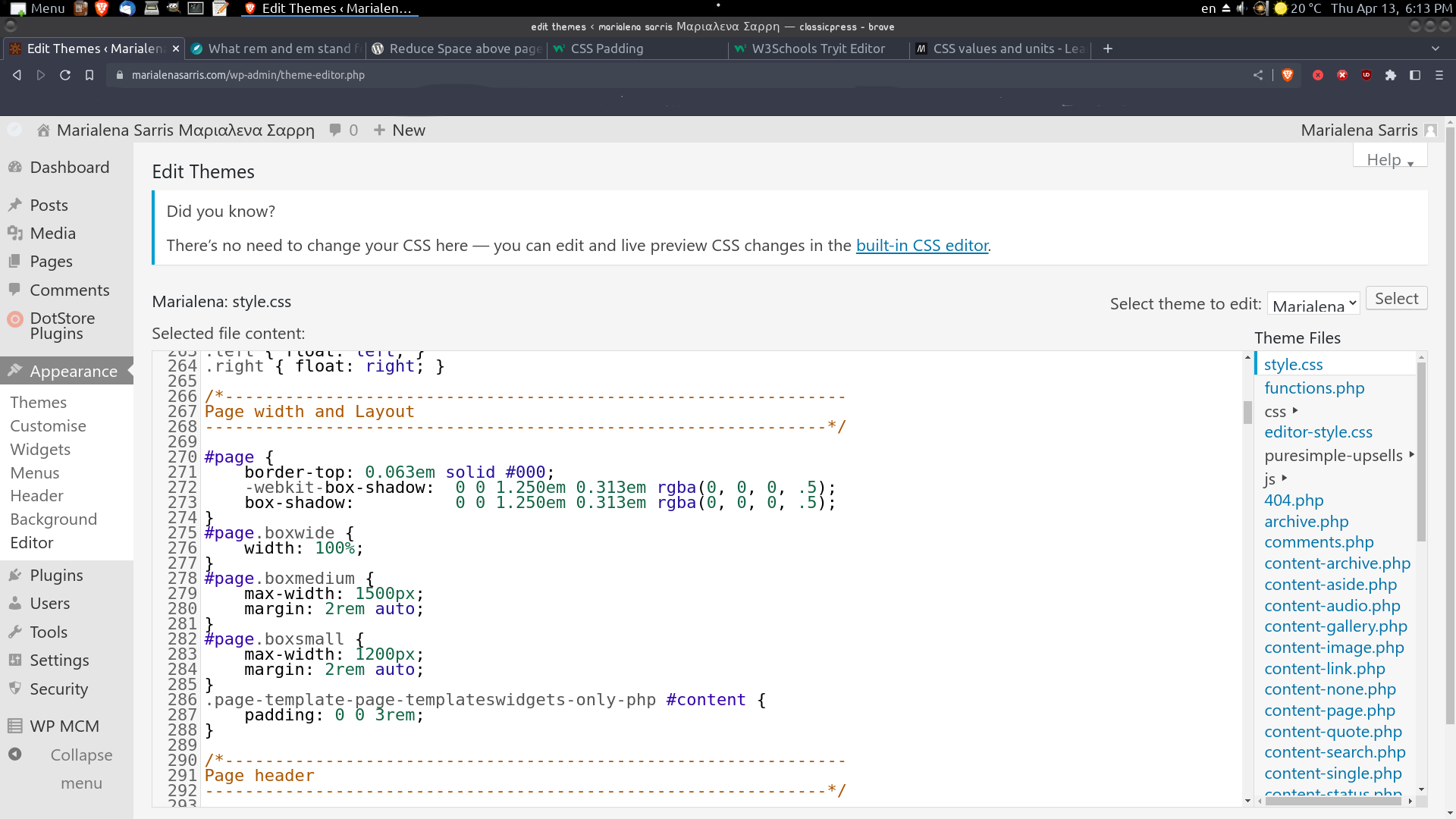
Looking at the site code, that is not even a margin. It was done by using a content section, setting another section into it, and giving the inner one a property of overflow before it (it means it can cover the outer one on the top part)
It’s like stacking two sheets of paper, the short one is at the bottom, and the longer one is given permission to sit on the shorter and have a piece of itself overflow on top.
As I understand it is a custom theme, which means someone needs to look at its CSS file to see where the overflow was set to change its values to something smaller (this can be done with custom CSS setting a new rule for that container).
As concerns “I see an inch, how many pixels it is” we do not use inches because I can have a VBS (Very Big Screen) while others might have smaller ones. setting inches or cm measurements means that on wider screens it is shown all small in the middle of the big screen instead of using it all because you set it to let’s say 2 cm. That is why you measure a screen in pixels. A pixel comes from the fact that to produce colors screens use dots of colored light, your eye won’t see the dots tho, just the color they make. (It is similar to how the eye works).
The gap is more visible on PC screens because the developer might have set a rule (media query) specific for smaller screens to reduce the overflow.
I checked the stylesheet, it is derived from a free/pro theme they have and on WP.org support forums I found this answer that seems related to what you are trying to accomplish.
I suggest you open a topic in the support forum in WP.org for the Pure & Simple theme that is the base for your theme, and ask them directly what is the best custom CSS to apply.
It is the home page layout that is custom and made by a fellow member some years ago. But the gap is global is not a characteristic of home page only, but I would like to get rid of it globally as I have tried to make my website as compact as possible on pc screens.
The rest of the theme is intact I mean that I haven’t changed anything on its css, I’ve just changed the colours and the options that it has.
This is a very good theme btw it is called Pure and Simple and it has a load of options, in its free version. I’m saying that in case someone wants to customize it if for ClassicPress. I use it from 2012 and it can change in whatever style I like and I do so often.
As for the layouts and colours there are unlimited options out there. I’m inspired from other themes but generally speaking I prefer simple layouts with easy navigation.
At the very end my website is just a portfolio one. It is not that I update it every day.
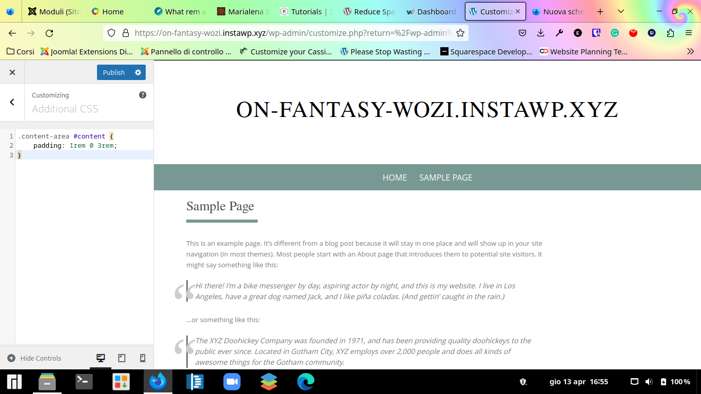
It says that this is a solution about reducing the space above page titles.
Are you certain that it means the gap that I want to reduce or the gap above the banner logo title of the whole page?
I’m trying to change something that I don’t understand how it works…
Great. And where do I copy this? Do I have to copy it in a particular section or it works everywhere?
This damn css had 2500 + lines and a load of sections.
 I figure out what is the space that I want to have to convert cm to pixels and these to the rems that the css understands! Is that so?