I have this style code, when I use “go live” in VS Code, it displays correctly as four boxes of different color like four square. In classic press the first box does not abide by the code. I have four divs of the appropriate names. I’m using the minimaze pro theme, its paid for so there are no restrictions with the theme.
.opening { background-color: blue; float: left; width: 50%; height:400px; } .content { background-color: yellow; float: right; width: 50%; height:400px; } .events { background-color: aqua; float: left; width: 50%; height:400px; } .news { background-color: brown; float: right; width: 50%; height:400px; }If you’re using flexbox, you shouldn’t be using floats. They will mess everything up. If you want to align things, use the appropriate flexbox properties. See CSS Flexbox Layout Guide | CSS-Tricks
But I don’t see any flexbox in your CSS.
jus to be clear, this is an example of implementation of flexbox row with 4 columns (responsive with different backgrounds, clearly you can format each column as a box as you need, but just by adding margins and padding you will be able to obtain the desired effect)
HTML
<div class="row">
  <div class="column">Column 1</div>
  <div class="column">Column 2</div>
  <div class="column">Column 3</div>
  <div class="column">Column 4</div>
</div>
CSS
.row {
  display: flex;
  flex-wrap: wrap;
}
.column {
  flex: 1 1 25%;
  padding: 20px;
  color: white;
  text-align: center;
}
.column:nth-child(1) { background-color: #ff6666; }
.column:nth-child(2) { background-color: #66b3ff; }
.column:nth-child(3) { background-color: #99ff99; }
.column:nth-child(4) { background-color: #ffcc66; }

@media (max-width: 768px) {
  .column {
    flex: 1 1 50%;
  }
}

@media (max-width: 480px) {
  .column {
    flex: 1 1 100%;
  }
}
This is just an example. Floats can be used in CSS, but as Tim mentions it is better not to mix them with flexbox that is an entirely different system. Moreover floats are something that nowadays is used less and less because flexbox makes it easy to write responsive css without having to be concerned about having to work with thousands of media queries.
my apology. I meant floats, and I thought floats were part of flex box. My mistake on terminology. I don’t understand when first float box don’t stay where it should in a classic press page but does format and work correctly when viewed with VS Code “go live”. I just dont get why one does it different. Taking the image out doesnt fix it either.
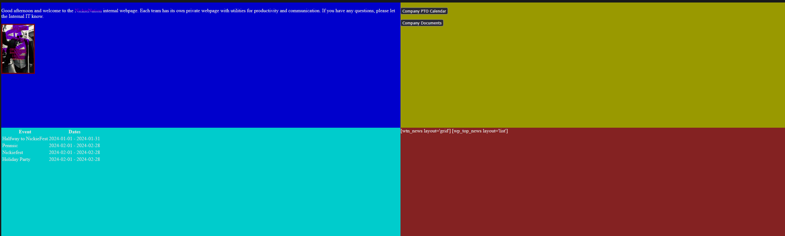
VS Code lets he have four boxes with “go live”, I’d display an image of that but i can only embed one thing a post as a new users.
not correct look with classic press
.opening { background-color: blue; float: left; width: 50%; height:400px; } .content { background-color: yellow; float: right; width: 50%; height:400px; } .events { background-color: aqua; float: left; width: 50%; height:400px; } .news { background-color: brown; float: right; width: 50%; height:400px; }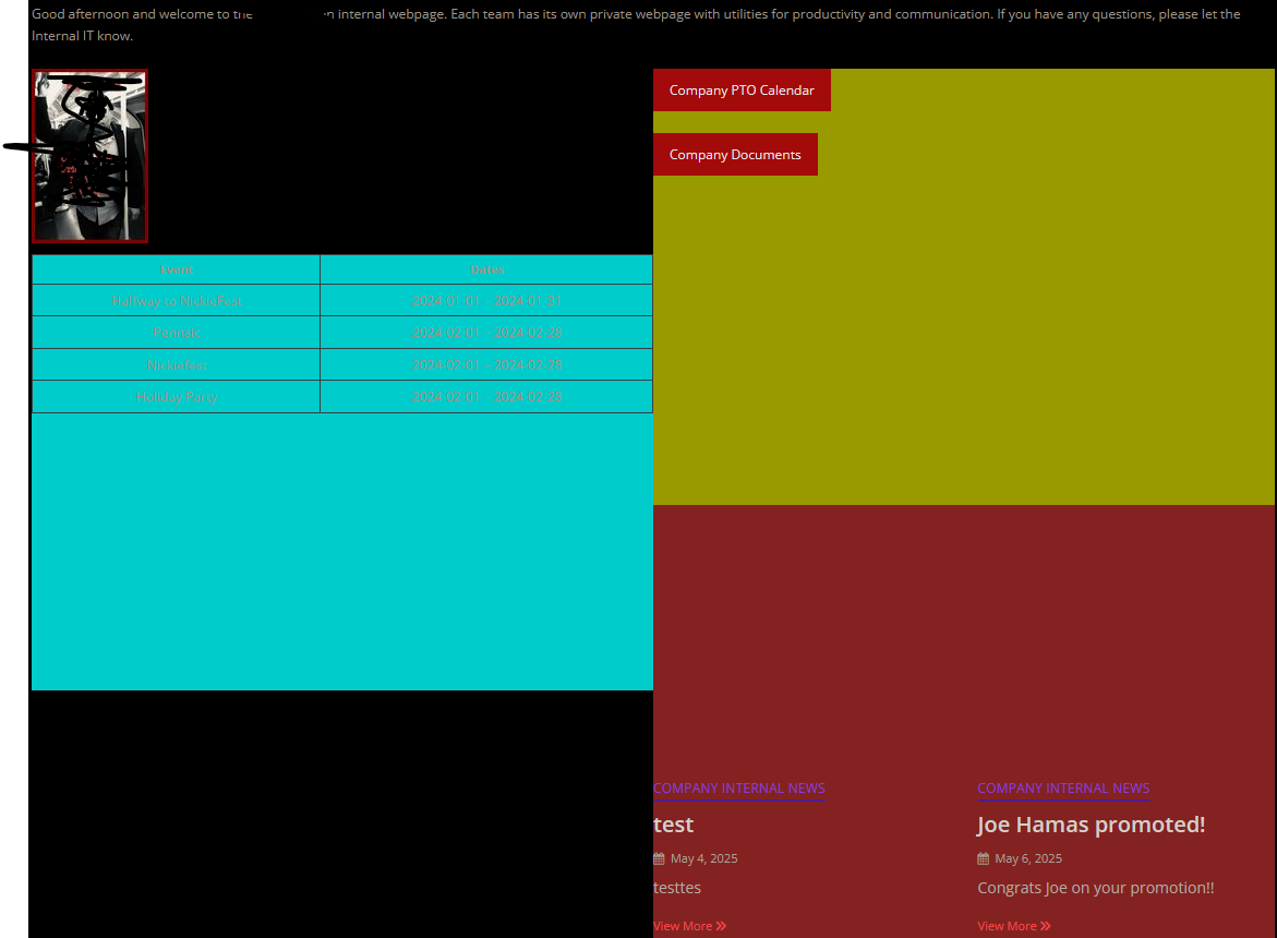
The problem with using floats is that they are influenced by what has gone before and then influence what happens later. They are notorious for being difficult to use. For that reason they are best avoided these days, now that CSS has much better tools available.
Rather than using floats, it would be better if you told us what you are trying to achieve, and then we can point you in the direction of how to achieve it.
In addition to what Tim is saying, in VSCode you have a clean environment that only has to show your markup and styles, while in CP the display on front-end is influenced by the theme CSS file that takes precedence over your code in certain conditions. This means your floats could misbehave due to a conflict with the theme’s CSS.
As i said above, floats are not up-to-date CSS, because they are hard to handle and can often misbehave and troubleshooting is very difficult.
Flexbox is easy to learn, is more modern and geared towards responsivity by design, gives cleaner code and there’s less a chance to conflicts with CP theme.
looking at what you want to achieve… you need this:
HTML
<div class="container">
    <div class="row">
      <div class="column col1-row1">Col 1 Row 1</div>
      <div class="column col2-row1">Col 2 Row 1</div>
    </div>
    <div class="row">
      <div class="column col1-row2">Col 1 Row 2</div>
      <div class="column col2-row2">Col 2 Row 2</div>
    </div>
  </div>
CSS
body, html {
    margin: 0;
    padding: 0;
    height: 100%;
  }
  .container {
    display: flex;
    flex-direction: column;
    height: 100vh;
  }
  .row {
    display: flex;
    flex: 1;
  }
  .column {
    flex: 1;
    display: flex;
    justify-content: center;
    align-items: center;
    color: white;
    font-size: 1.5rem;
  }
  .col1-row1 {
    background-color: #FF5733; /* red-orange */
  }
  .col2-row1 {
    background-color: #33C1FF; /* blue */
  }
  .col1-row2 {
    background-color: #75FF33; /* green */
  }
  .col2-row2 {
    background-color: #FF33D4; /* pink */
  }
  @media (max-width: 600px) {
    .container {
      height: auto;
    }
    .row {
      flex-direction: column;
      height: auto;
    }
    .column {
      flex: none;
      height: 100px;
    }
  }
This in flexbox gives exactly what you are wanting to achieve. A 2 rows x 2 columns space with different backgrounds. Then you can put your elements inside each column.
For that you should use CSS Grid. Here’s the best explanation of how to use it: CSS Grid Layout Guide | CSS-Tricks
Essentially, you declare the container element that holds these four sub-elements as having display: grid; and then you specify things like their size (e.g. grid-template-columns: repeat(auto-fill, minmax(350px, 1fr));) and the gaps between them (such as grid-gap: 3em;).
you all are fast.
my last question, where in the example would I put like the names “news” or “calendar”?
If you’re using Grid, you want to have a container div with four child divs. Inside each child div you can have a header (probably h2 or h3, definitely not h1) and you can put the various titles in the header. Then you can put the content underneath, just making sure you keep within the same div.
If this is really going to be a list of four items, though, then the parent should be a ul and not a div, with the children each being an li rather than a div.
Looking at Elizabeth’s example, I was just trying to figure out what I would change to use the names I want to inside her example.
Like so…
<div class="container">
    <div class="row">
      <div class="column col1-row1">
<h2> This is my AWESOME calendar</h2>
<p>I input all the meetings here</p>
</div>
      <div class="column col2-row1">
<h2>NEWS</h2>
<p>Here you read my blog entries</p>
</div>
    </div>
    <div class="row">
      <div class="column col1-row2"><h2>SERVICES</h2>
<p>Here you can see my services</p>
</div>
      <div class="column col2-row2">
<h2>NEWS</h2>
<p>Here you can fill in the form to contact me</p>
</div>
    </div>
  </div>
I just placed dummy content in the columns (that’s where your content goes, inside the .column elements).
As Tim suggests for your application of the code, using grid might be even better - basically the grid system is another way to use flexbox, and the tutorial Tim linked is one of the best you can use to learn it. It works similarly to my example here… you put content in the column elements.
(and yes we are fast because this is fairly easy…  - once you learn Flexbox and Grid you will never look back to floats)
I was trying to figure out how to more granually place my elements on the page, like the picture under the first set of text, so I tried going and doing something that seemed basic to test out and learn to do it, but it seems none of the css is working, just the html, what am I missing?
<!DOCTYPE html>
<html lang="en">


<head>
<meta charset="UTF-8">
    <meta name="viewport" content="width=device-width, initial-scale=1.0">
    <title>css`Preformatted text`grid</title>

<style>


.grid-container {
    display: grid;
    grid-template-rows: 100px 100px 100px 100px 100px 100px 100px;
    grid-template-columns: 100px 100px 100px 100px 100px 100px 100px;
}

.grid-item {
border-top: 1px solid #dfdfdf;
}

.item-1 {
background-color: red;
grid-row 1 / 2;
grid-column 1/4;
}

.item-2 {
background-color: yellow;
grid-row 3/ 4;
grid-column 1/4;
}

.item-3 {
background-color: blue;
grid-row 5 / 6;
grid-column 1/4;
}

</style>
</head>
<body>
<div class="grid-container">
<div class="grid-item item-1">1 and a bunch of other words that probably do not really matter to anyone in the world.</div>
<div class="grid-item item-2">2 and a bunch of other words that probably do not really matter to anyone in the world</div>
<div class="grid-item item-3">3 and a bunch of other words that probably do not really matter to anyone in the world</div>
</body>
</html>
You’re trying to micro-manage the CSS. Just use what I gave you as the starting-point. Which gives you this:
.grid-container {
    display: grid;
    grid-template-columns: repeat(auto-fill, minmax(350px, 1fr));
    grid-gap: 3em;
}
Now you should see a grid.
I think a level micro managing is intentional as I was told certain elements have to be placed in specific spots on the screen.
I don’t know what you mean by “specific spots”. Things will move around according to whether someone is using a phone, tablet, laptop, or desktop screen to view the site, so if the idea really is to have specific things in specific places at all times, then that person is going to be disappointed. Instead you need to work with browsers and not against them. Using code like the snippet I have provided does just that. If, however, you double down on the micromanaging, you will almost certainly find that it looks good on a screen of a specific width but looks terrible at other widths.
I what I mean is… like the two link buttons need to be like grid row 2, column 4… the table needs to be like grid row 5 column 1 / 3.