Since CP is a very mce editor focused CMS, it would be to our advantage to create a best use case for contrast and usability of the tiny-mce editor assets. Preferably we would be more concerned about “presentation” and accessibility standards than WP is, since it is the main focus of what user will use to edit content with.
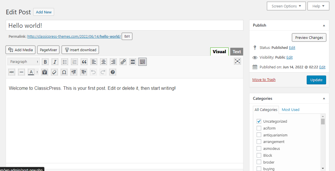
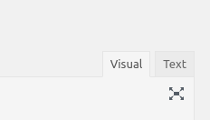
The main concern that I see is the contrast between the ‘Visual’ and ‘Text’ editor tabs is not very distinct and the letter to background ration of contrast is very poor at best. Best case would be to change the lettering to a darker color and the background should be lighter. A good example is the Custom Fields Box in Screen Options where it has about three separate color pallets that handle backgrounds and colors.
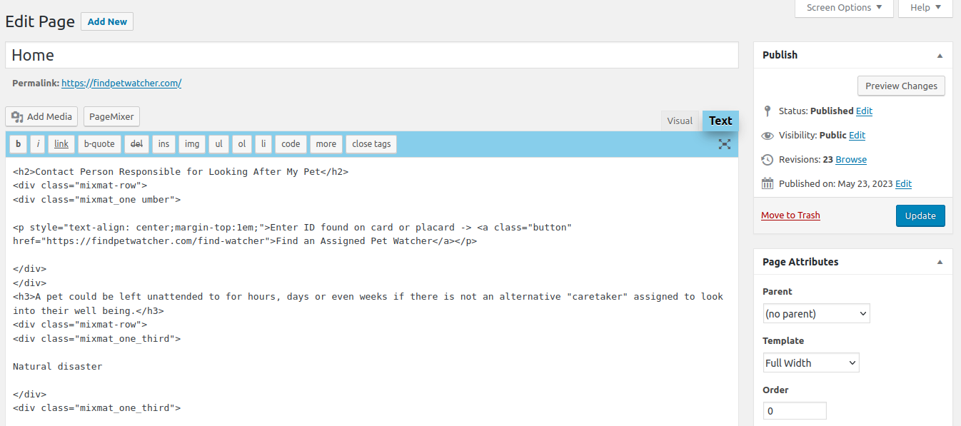
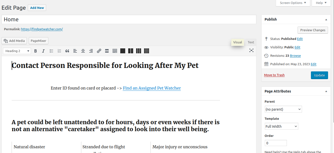
The Editor tabs switcher has only on palette consisting of background: #ebebeb; and background: #f5f5f5; (active tab)
Technically these colors are not far-enough-apart to provide good UI/UX. But historically most people have grown to accept the colors.
Possible implementation
suggest a way to implement your petition.
Simple implementation could be as minor as adding editor styles via the add_filter( 'mce_css', 'compliant_filter'); method.
Will you be able to help with the implementation?
At minimum suggest border color enhancement to active tab
Since this is only a proposal for petition, I will work on a reasonable solution to what I feel is a good looking and operable tab switcher color theme.
Thanks for sharing. Is this something that’s fixed in WordPress, do you know? WordPress did a high contrast refresh not too long ago, it might be fixed there. We did not port that yet.
I do want to do more accessibility backports from WordPress, make CP more accessible.
In the plugin for the editor upgrade, it includes a dark color scheme for the editor. I tweaked that and was also removing all colors from the editor CSS, replaced by custom properties which could be easily styled by themes.
The TinyMCE way is to use computed colors using LESS to generate a skin.
I worked out a way to compute in CSS instead, using black and white, but haven’t implemented it in the editor CSS. I proposed it at WP for the admin color scheme overhaul, but that effort has gone silent.
As this petition only mentions the active tab colors, it seems that all the other editor color stuff is moot, but the admin color scheme work at WP was for affecting the entire page (every admin page), instead of just the sidebar, links, and buttons. That would be the best way toward improvement. Also, the editor skin uses that same low contrast difference when hovering on a toolbar icon.
Plus 1 for proposing to @viktor “…do more [for] accessibility…” AND Plus one for @joyously encouraging this petition actually be more useful as a petition if it was for more than (just) switch-editor tabs. ← the latter is actually where I was going with this petition, but figured that I would start small and work on accessibility and color/contrast styles if enough peeps were interested in improving the Editor UI/UX.
Most productive comment that I think I made in the first thread of this chain is that CP is MORE importantly using the mce editor than WP. So a Plus-Plus for CP would be to center as much attention on the fine-points of the Editor Experience.
Maybe there are some WP-core things that I have overlooked or was not aware of that can be utilized. I like the idea of admin color scheme but not as much as I like the idea of admin style and useability scheme with just enough “color” to make things fun/easier to navigate, etc.
Will try to work on a presentation that may better explain the admin journey I have in mind. (At least parts of the ‘journey’)
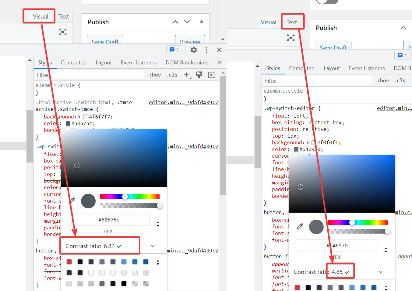
I can’t actually determine from just looking at the tabs, which one is active and which is not.
And it takes more than just changing the default colors. There are hover states and selected states.
This is good, but it would be better to start by finding the changesets that WP used, because they improve accessibility throughout the back-end and not just with the editor. Then we can enhance them further like this.
I am full aware of states and accessibility and colors. It was the idea of layout as well to focus on. We can assume the simple stuff, as developers, but thanks for mentioning.
Cheangesets from WP would be great to know about. My idea is very rough and based more on ideology than anything, so if you have any links to current changesets or ongoing work in git or wp.org that would be great. I should spend some time looking for these now that you brought it up and I am aware of this.
Still not sure what can “enhance” the user experience for Editor but I’m sure there is something we can do to make it look like it belongs to CP. Mostly, I think the idea is so the editor does not get too stale or so that the community knows that we still love our little tiny mce. LOL
I think I really like the idea of improving these tabs! and today, rereading your comment joyously, I noticed that I can’t be sure if you are referring to the tabs as they are now in CP or tradesouthwest’s screenshot, because I have noticed that every single time I come back to an edit page from another browser tab, I have to click again on the editor tabs because I never have a clue which is active!!!
The contrast for the current tab colors is too low, but at least it makes sense to me. The one that is more legible is active.
The proposed change makes both tabs a better contrast, but then you can’t tell which is the active tab that way.
I know this thread is about a couple of months old, but I will need to add into this thread. In order to tell which tab is active to screen readers, there needs to be an aria-current attribute.
For example, you may not set aria-hidden to true if an HTML element is focusable. If aria-hidden is set to true and a div container that contains interactive elements has a tabindex of 0, you would be sending mixed signals to screen readers. An element with tabindex="0" and aria-hidden="true" tells a screen reader that the element does not exist, yet it’s focusable. Screen readers will speak nothing to blind users!
I am hoping I can be of help to everyone. We need to bring this up from time to time if ClassicPress were to be improved over time.
This @GraysonPeddie is a most salient point of interest for the topical thread here. In fact I would say it would be more important to run a petition for better WAI/accessability attributes in/to the editor tabs than my original request to make the tabs more visually significant. ( Ialso propose to have the entire editor ‘frame’ more visually pleasing and interactively useful (standard UI/UX).
If we are promoting tiny mce editor it should be fully compliant on all levels. Could you imagine making Gutenberg modules compliant across all filters and editing attributes. That would be a project. So at least tmce efforts to bring CP up to accessibility ratings would be a reachable project.
 At minimum suggest border color enhancement to active tab