In the frontend yes, but not in the backend. Maybe the first step would be to improve wording, getting rid of the word sidebar. Functions like get_sidebar() can be kept for backwards compatibility but new functions introduced like get_widget_area().
I’ve used “sidebars” for all sort of layouts over the years. The main issue trying to explain to clients was the way it looked in the backend. You have a 3-column footer in the frontend, but in the backend, it’s either 1 sidebar per column or 1 sidebar with 3 widgets inside stacked vertically. Clients are usually confused trying to understand it.
I need to update ClassicPress website, and I’ve been thinking. What exactly are we trying to achieve? Are we simply WordPress without Gutenberg? Or are we trying to build something different, something better, and leave WordPress shadow.
That brings a different question, who are we building it for? Our homepage says “CMS for creators”, who are the creators? Are they non-technical users or developers? We continue to make CP better for technical users, the developers. Yet we haven’t really thought much about non-technical users.
If we’re making a CMS for developers, we should update copy on the website to say that. If we want non-technical users to be able to use it, we should look at ways to make it easier for them to create and manage their website (Gutenberg isn’t the answer).
Sidebars were introduced in 1.5.0, I believe. They’re almost the same 15 years later, and people continue to use them in a hacky way for various layouts that are no vertical sidebars on the left or right.
We need to address that, we need to align UI/UX to how it’s used.
It’s already in the core, I want to improve UI/UX so it’s easier to use for non-technical users. And yes, I’ve seen Joy’s theme. That’s what made me think of improving the widgets page.
My idea is to continue to allow themes to manage widget areas (sidebars) as they did. We would simply extend and improve on that functionality to make it more usable and friendly.
I’m only now thinking about it, so I only have a few ideas I’ve wished widget areas did:
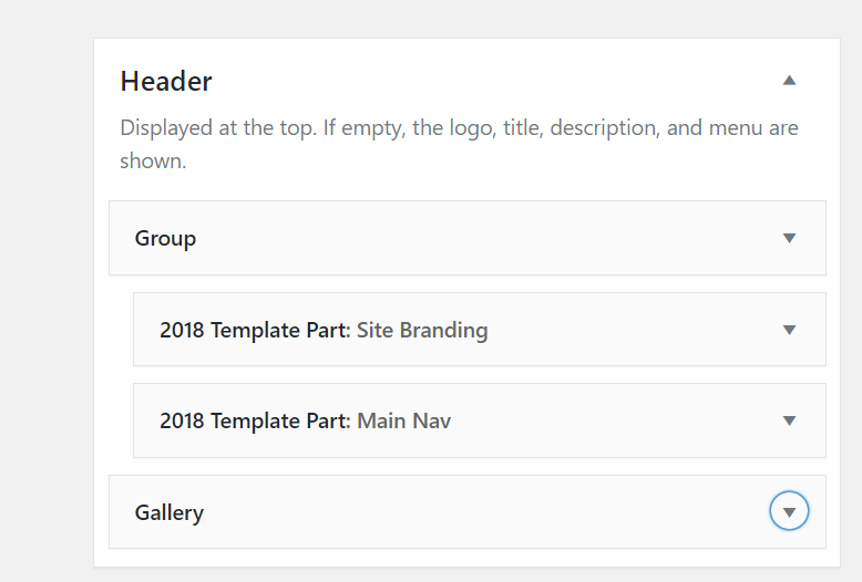
- Grouping widgets together using a group widget, which basically would wrap a div or something around that set of widgets. Something like this:
-
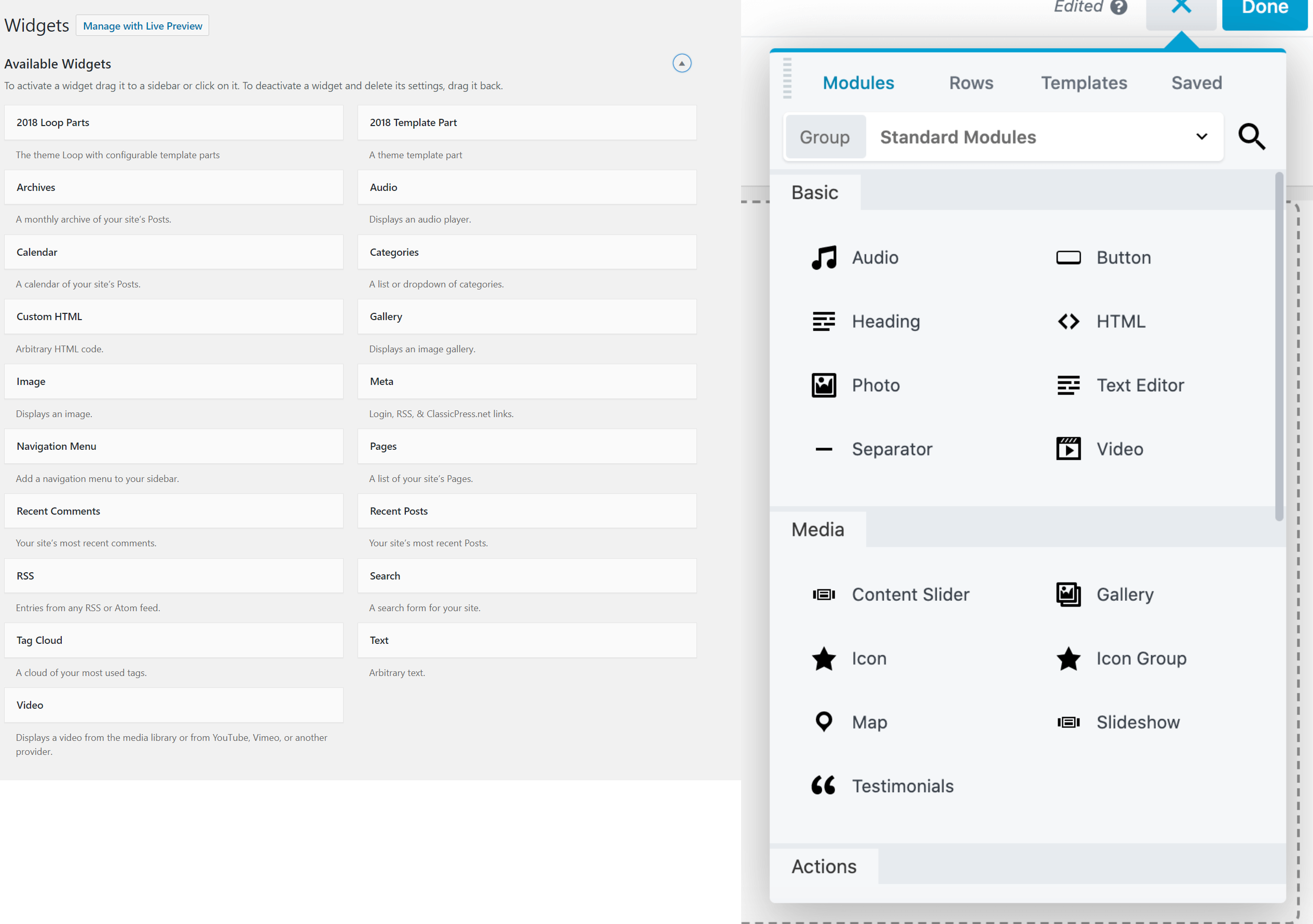
I’ve always liked Beaver Builder’s panel with all the modules. They group them, make it searchable so it’s easy to find and they don’t take up as much space as available widgets. For reference, compare them:
-
Ability to save widgets, so they can be re-used in another widget area easily.
-
Ability to duplicate a widget with all the settings.
-
Ability for themes to load widget presets, so widgets don’t start from scratch.
-
Ability to export/import widget configuration/settings. Make it easier for theme developers to provide demo content importer if widgets will be a big part of theme development.
-
Themes/plugins registering their own custom widgets should be grouped together in a separate category/section. Sometimes developers use generic names, and it’s hard to figure out custom widgets from a theme, plugins, etc.
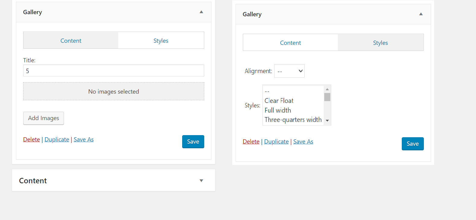
EDIT: 8. I forgot the ability for widgets to have tabs to separate options - content | styles | options (or custom tabs set by the developer). Point is, that we shouldn’t have scrollable widgets because they have so many options. Plus it’s easier to find what you need. Do you need background color change? Styles tab. Do you need to edit title of the widget, content tab.
Whatever we do, we do need to improve UX/UI and align them with the actual usage - not obsolete sidebars.
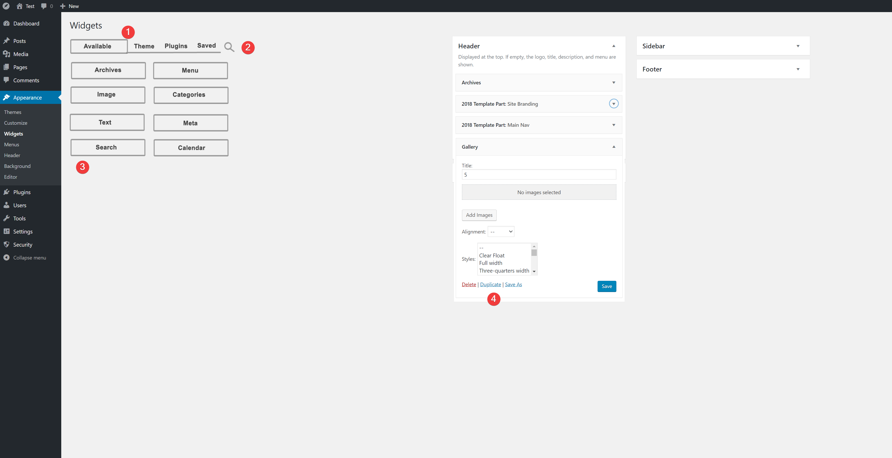
Remember, take your developer shoes off for a moment and put on the shoes of a typical non-technical user who will be using it. This is what we have right now and need to improve: